前段时间刷抖音,觉得关注时的按钮动画很好看,加上自己本身最近也在学习前端知识。所以就想怎么自己实现出来,最终效果还可以,但是感觉自己做的还不够好。仅供参考。
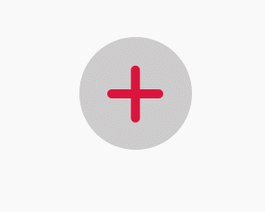
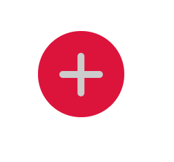
🍻最终效果
💡思路
-
使用jQuery的toggleClass()方法,添加删除类active
-
分别为原本的和active的元素设置样式,使用css的transition属性,定义变化时间,速度等
-
使用css的animation为active元素设置变化动画
👨💻实现
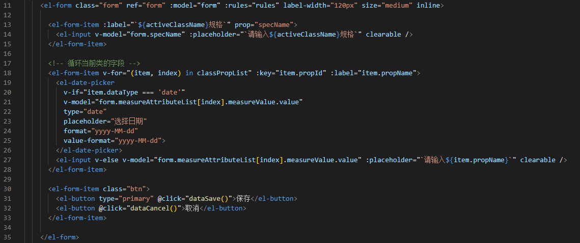
HTML
<!DOCTYPE html>
<html lang="en">
<head>
    <meta charset="UTF-8">
    <meta name="viewport" content="width=device-width, initial-scale=1.0">
    <meta http-equiv="X-UA-Compatible" content="ie=edge">
    <script src="https://apps.bdimg.com/libs/jquery/2.1.4/jquery.min.js"></script>
    <link rel="stylesheet" href="style.css">
    <title>Document</title>
</head>
<body>
    <!-- 简单起见,用了div。其实用button也行,需要设置一下样式才好看^_^-->
    <!-- 还没有学习<svg>,使用<svg>效果也许会更好-->
    <div id="followBtn">
        <div id="line1"></div>
        <div id="line2"></div>
    </div>
    <script src="index.js"></script>
</body>
</html>
|
JS
$(function () { // jQuery入口函数
    $('#followBtn').click(function (e) {    // 绑定点击事件
        $('#followBtn').toggleClass('active');
        $('#line1').toggleClass('active');
        $('#line2').toggleClass('active');
    });
})
|
CSS
body {
    width: 1024px;
    margin: 0 auto; /* 居中 */
}

#followBtn {
    position: relative;
    display: block;
    width: 100px;
    height: 100px;
    margin: 100px auto;
    border-radius: 100px;   // 使div变为圆形
    background-color: #ccc;
    transition: all linear .5s; // 定义样式转换时的过度动画的属性
}

#followBtn.active {
    background-color: crimson;
}

#line1 {
    position: absolute; /*绝对定位,定位基于最近的一个已经定位(relative, absolute, fixed)的祖先元素*/
    left: 25px;
    top: 46px;
    display: block;
    width: 50px;
    height: 8px;
    border-radius: 5px;
    background-color: crimson;
    transition: all linear .5s;
}

#line2 {
    position: absolute;
    left: 25px;
    top: 46px;
    display: block;
    width: 50px;
    height: 8px;
    border-radius: 8px;
    background-color: crimson;
    transform: rotate(90deg);   /* 旋转90度 */
    transition: all linear .5s;
}

#line1.active {
    background-color: #ccc;
    /*触发动画,forwards表示动画结束后,元素样式保留为动画的最后一个关键帧的样式*/
    animation: line1 .5s ease-in-out forwards;
}

#line2.active {
    background-color: #ccc;
    animation: line2 .5s ease-in-out forwards;
}

/* @keyframes定义动画 */
@keyframes line1 {
    50% {
        width: 8px;
        height: 8px;
        left: 20px;
        top: 52px;
        border-radius: 8px;
    }
    100% {
        width: 30px;
        left: 20px;
        top: 52px;
        transform: rotate(45deg);
    }
}

@keyframes line2 {
    50% {
        width: 8px;
        height: 8px;
        border-radius: 8px;
        left: 35px;
    }
    100% {
        width: 50px;
        left: 35px;
        transform: rotate(-45deg);
    }
}
|
分割线👇👇👇使用svg绘制对号✔🍻最终效果
👨💻实现
HTML
<!DOCTYPE html>
<html lang="en">

<head>
    <meta charset="UTF-8">
    <meta name="viewport" content="width=device-width, initial-scale=1.0">
    <meta http-equiv="X-UA-Compatible" content="ie=edge">
    <script src="https://cdn.bootcss.com/jquery/3.4.1/jquery.min.js"></script>
    <link rel="stylesheet" href="style.css">
    <title>Document</title>
</head>

<body>
    <button id="followBtn">
        <div class="line"></div>
        <div class="line"></div>
        <!-- 使用svg绘制 -->
        <!-- stroke-linecap 设置折线两端为圆角 -->
        <!-- stroke-linejoin 设置折线拐角为圆角 -->
        <svg width="70px" height="70px" stroke-width="8" stroke-linecap="round" stroke-linejoin="round" fill="none">
            <polyline points="10,37 30,57 60,17" style="stroke: crimson;"></polyline>
        </svg>
    </button>
    <script src="index.js"></script>
</body>

</html>
|
JS
❗❗❗一定要使用jQuery3,3以下的版本操作svg元素(添加类)时有bug,3修复了这个问题。
$(function () {
    $('#followBtn').click(function (e) {
        $('#followBtn').toggleClass('active');
        $('.line').toggleClass('active');
        $('polyline').toggleClass('active');
    });
})
|
CSS
body {
    width: 1024px;
    margin: 0 auto;
}

#followBtn {
    position: relative;
    display: block;
    width: 100px;
    height: 100px;
    margin: 100px auto;
    border: none;
    border-radius: 100px;
    background-color: crimson;
    transition: all linear .5s;
}

#followBtn:focus {
    outline: none;  /* 浏览器点击不会有蓝框 */
}

#followBtn.active {
    background-color: #ccc;
}

.line {
    position: absolute; /*绝对定位,定位基于最近的一个已经定位(relative, absolute, fixed)的祖先元素*/
    left: 25px;
    top: 46px;
    width: 50px;
    height: 8px;
    border-radius: 8px;
    background-color: #ccc;
    transition: ease-in 0;
}

.line:nth-child(1) {
    transform: rotate(90deg);
}

.line.active {
    animation: fade .5s forwards;
}

polyline {
    /* 属性stroke-dasharray设置线段缺口以形成曲线,
     * 当缺口足够大,看起来折线就隐藏了
     * 属性stroke-dashoffset指定了dash模式到路径开始的距离,0时折线完全显示
     */
    stroke-dasharray: 80px;
    stroke-dashoffset: 80px;
}

polyline.active {
    animation: show .5s forwards;
    animation-delay: .5s;
}

@keyframes show {
    to {
        stroke-dashoffset: 0;
    }
}

@keyframes fade {
    to {
        opacity: 0;
        transform: rotate(360deg) scale(0.5, 0.5);
    }
}
|
👨🎓感悟
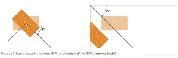
普通HTML元素和SVG元素的旋转方式不同:
普通HTML元素的transform-origin默认为自身的中心SVG元素的transform-origin默认为SVG画布的左上角
去除按钮点击后的蓝框,可以设置outline: none;
jQuery3以下的版本,不能正确的给修改SVG元素的类。
//.attr()方法对于SVG是有效的,所以如果你必须使用jQuery的话
// 使用
$("#item").attr("class", "oldclass newclass"); // 而不是 .addClass("newclass")
// 使用
$("#item").attr("class", "oldclass"); // 而不是 .removeClass("newclass")
// 原生JS解决办法
var element = document.getElementById("item");
// 使用
element.setAttribute("class", "oldclass newclass");
// 使用
element.setAttribute("class", "oldclass");
|
🔗参考
|


