广告位联系
返回顶部
分享到

css3实现背景模糊的三种方式

css 来源:互联网搜集 作者:秩名 发布时间:2020-05-17 15:20:00 人浏览
摘要

一、普通背景模糊 代码: ? 1 2 3 4 5 6 7 8 9 10 11 12 13 14 15 16 17 18 19 20 21 22 23 24 25 26 27 28 29 30 31 32 33 34 35 36 37 38 39 40 41 42 Style html, body { width: 100%; height: 100%; } * { margin: 0; padding: 0; } /*背景模糊*/ .bg {

一、普通背景模糊

代码:

?
1
2
3
4
5
6
7
8
9
10
11
12
13
14
15
16
17
18
19
20
21
22
23
24
25
26
27
28
29
30
31
32
33
34
35
36
37
38
39
40
41
42
<Style>
        html,
        body {
            width: 100%;
            height: 100%;
        }
 
        * {
            margin: 0;
            padding: 0;
        }
 
        /*背景模糊*/
        .bg {
            width: 100%;
            height: 100%;
            position: relative;
            background: url("./bg.jpg") no-repeat fixed;
            background-size: cover;
            box-sizing: border-box;
            filter: blur(2px);
            z-index: 1;
        }
 
        .content {
            position: absolute;
            left: 50%;
            top: 50%;
            transform: translate(-50%, -50%);
            width: 200px;
            height: 200px;
            text-align: center;
            z-index: 2;
        }
    </Style>
</head>
 
<body>
    <div class="bg">
        <div class="content">背景模糊</div>
    </div>
</body>
 

效果如下所示:

这样写会使整个div的后代模糊并且还会出现白边,导致页面非常不美观,要想解决这个问题,我们可以使用伪元素,因为伪元素的模糊度不会被父元素的子代继承。

代码:

?
1
2
3
4
5
6
7
8
9
10
11
12
13
14
15
16
17
18
19
20
21
22
23
24
25
26
27
28
29
30
31
32
33
34
35
36
37
38
39
40
41
42
43
44
45
46
47
48
49
50
51
52
53
54
55
<Style>
        html,
        body {
            width: 100%;
            height: 100%;
        }
 
        * {
            margin: 0;
            padding: 0;
        }
 
        /*背景模糊*/
        .bg {
            width: 100%;
            height: 100%;
            position: relative;
            background: url("./bg.jpg") no-repeat fixed;
            background-size: cover;
            box-sizing: border-box;
            z-index: 1;
        }
 
        .bg:after {
            content: "";
            width: 100%;
            height: 100%;
            position: absolute;
            left: 0;
            top: 0;
            /* 从父元素继承 background 属性的设置 */
            background: inherit;
            filter: blur(2px);
            z-index: 2;
        }
 
 
        .content {
            position: absolute;
            left: 50%;
            top: 50%;
            transform: translate(-50%, -50%);
            width: 200px;
            height: 200px;
            text-align: center;
            z-index: 3;
        }
    </Style>
</head>
 
<body>
    <div class="bg">
        <div class="content">背景模糊</div>
    </div>
</body>
 

效果如下所示:

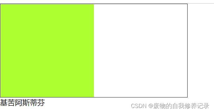
二、背景局部模糊

上一个效果会了之后,局部模糊效果就比较简单了。

代码:

?
1
2
3
4
5
6
7
8
9
10
11
12
13
14
15
16
17
18
19
20
21
22
23
24
25
26
27
28
29
30
31
32
33
34
35
36
37
38
39
40
41
42
43
44
45
46
47
48
49
50
51
52
53
54
55
56
57
58
59
60
61
62
63
64
65
66
67
<Style>
        html,
        body {
            width: 100%;
            height: 100%;
        }
 
        * {
            margin: 0;
            padding: 0;
        }
 
        /*背景模糊*/
        .bg {
            width: 100%;
            height: 100%;
            position: relative;
            background: url("./bg.jpg") no-repeat fixed;
            background-size: cover;
            box-sizing: border-box;
            z-index: 1;
        }
 
        .content {
            position: absolute;
            left: 50%;
            top: 50%;
            transform: translate(-50%, -50%);
            width: 200px;
            height: 200px;
            background: inherit;
            z-index: 2;
        }
 
        .content:after {
            content: "";
            width: 100%;
            height: 100%;
            position: absolute;
            left: 0;
            top: 0;
            background: inherit;
            filter: blur(15px);
            /*为了模糊更明显,调高模糊度*/
            z-index: 3;
        }
 
        .content>div {
            width: 100%;
            height: 100%;
            text-align: center;
            line-height: 200px;
            position: absolute;
            left: 0;
            top: 0;
            z-index: 4;
        }
    </Style>
</head>
 
<body>
    <div class="bg">
        <div class="content">
            <div>背景局部模糊</div>
        </div>
    </div>
</body>
 

效果如下图所示:

三、背景局部清晰

代码:

?
1
2
3
4
5
6
7
8
9
10
11
12
13
14
15
16
17
18
19
20
21
22
23
24
25
26
27
28
29
30
31
32
33
34
35
36
37
38
39
40
41
42
43
44
45
46
47
48
49
50
51
52
53
54
55
56
57
<Style>
        html,
        body {
            width: 100%;
            height: 100%;
        }
 
        * {
            margin: 0;
            padding: 0;
        }
 
        /*背景模糊*/
        .bg {
            width: 100%;
            height: 100%;
            position: relative;
            background: url("./bg.jpg") no-repeat fixed;
            background-size: cover;
            box-sizing: border-box;
            z-index: 1;
        }
 
        .bg:after {
            content: "";
            width: 100%;
            height: 100%;
            position: absolute;
            left: 0;
            top: 0;
            background: inherit;
            filter: blur(5px);
            z-index: 2;
        }
 
        .content {
            position: absolute;
            left: 50%;
            top: 50%;
            transform: translate(-50%, -50%);
            width: 200px;
            line-height: 200px;
            text-align: center;
            background: inherit;
            z-index: 3;
            box-shadow: 0 0 10px 6px rgba(0, 0, 0, .5);
        }
    </Style>
</head>
 
<body>
    <div class="bg">
        <div class="content">
            <div>背景局部清晰</div>
        </div>
    </div>
</body>
 

效果如下图所示:


版权声明 : 本文内容来源于互联网或用户自行发布贡献,该文观点仅代表原作者本人。本站仅提供信息存储空间服务和不拥有所有权,不承担相关法律责任。如发现本站有涉嫌抄袭侵权, 违法违规的内容, 请发送邮件至2530232025#qq.cn(#换@)举报,一经查实,本站将立刻删除。
原文链接 : https://www.jb51.net/css/725508.html
相关文章
  • 本站所有内容来源于互联网或用户自行发布,本站仅提供信息存储空间服务,不拥有版权,不承担法律责任。如有侵犯您的权益,请您联系站长处理!
  • Copyright © 2017-2022 F11.CN All Rights Reserved. F11站长开发者网 版权所有 | 苏ICP备2022031554号-1 | 51LA统计