效果:

css:
.s_type {
    border: none;
    border-radius: 5px;
    background-color: #f3f3f3;
    padding: 7px 0;
    color: #606266;
    margin: 5px 2.5% 5px 0;
    width: 30%;
    position: relative;
}

.selecd {
    background-color: #ebf3ff;
    color: #5999fc;
}

.select {
    background-color: #ebf3ff;
    color: #5999fc;
}

.select:before {
    content: '';
    position: absolute;
    right: 0;
    bottom: 0;
    border: 9px solid #5999fc;
    border-top-color: transparent;
    border-left-color: transparent;
}
|
html:
<button class="s_type">全部</button>
<button class="s_type">2020年夏季</button>
|
js:
$(’.s_type’).on(‘click’,function(){
$(this).toggleClass(‘select’);
});
|
1:设计好按钮本身的样式(.s_type)
2:将要加的样式另写一个类名(.selecd )
3:通过点击事件将元素添加样式
刚开始想过挺多方法的,比如直接在伪类里content: ‘✔’;但这样的话出的效果就是对号没有背景颜色,直接白了一块,这样不行。还想到要不直接把UI的图抠出来,当背景或者图片直接浮在按钮上面,后面想想这样不太对。然后我就先去做别的功能,把其他功能写出来再弄这个。就刚好看到一篇文章跟我需要的功能一样,就直接按照这篇博客写了。。。然后效果出来了哈哈哈哈
后面去看UI库之类的发现QQ的UI库还有专门角标设计(地址)
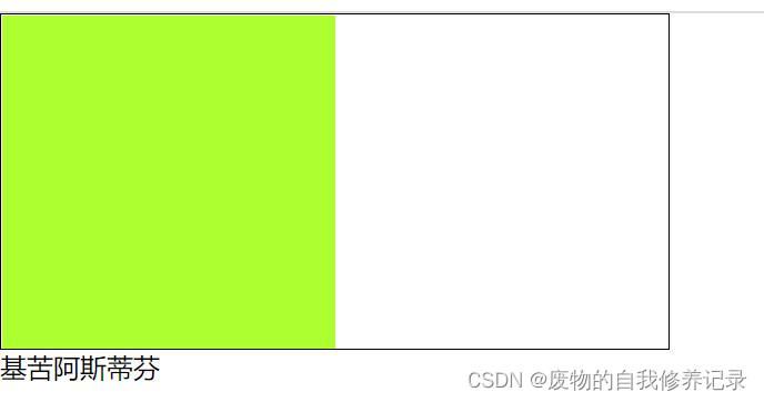
附录:下面看下css 选中框样式
在项目中经常会用到下图样式的选中样式

在网上找了一下,思路其实就是对矩形进行变形处理,通过伪元素实现下标 css样式:
.select {
        position: relative;
        width:81px;
        height:93px;
        margin: 0 auto;
        text-align: center;
        line-height: 93px;
        color: #4ABE84;
        background-color: #fff;
        box-shadow:0px 2px 7px 0px rgba(85,110,97,0.35);
        border-radius:7px;
        border:1px solid rgba(74,190,132,1);
    }
    .select:before {
        content: '';
        position: absolute;
        right: 0;
        bottom: 0;
        border: 17px solid #4ABE84;
        border-top-color: transparent;
        border-left-color: transparent;
    }
    .select:after {
        content: '';
        width: 5px;
        height: 12px;
        position: absolute;
        right: 6px;
        bottom: 6px;
        border: 2px solid #fff;
        border-top-color: transparent;
        border-left-color: transparent;
        transform: rotate(45deg);
    }
|
然后是我们通过使用div来展示效果:
<div class="select">测试</div>
|
完成。
|


