广告位联系
返回顶部
分享到

css3实现的加载动画效果

css 来源:转载 作者:秩名 发布时间:2021-04-08 15:05:42 人浏览
摘要

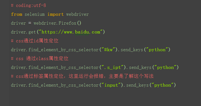
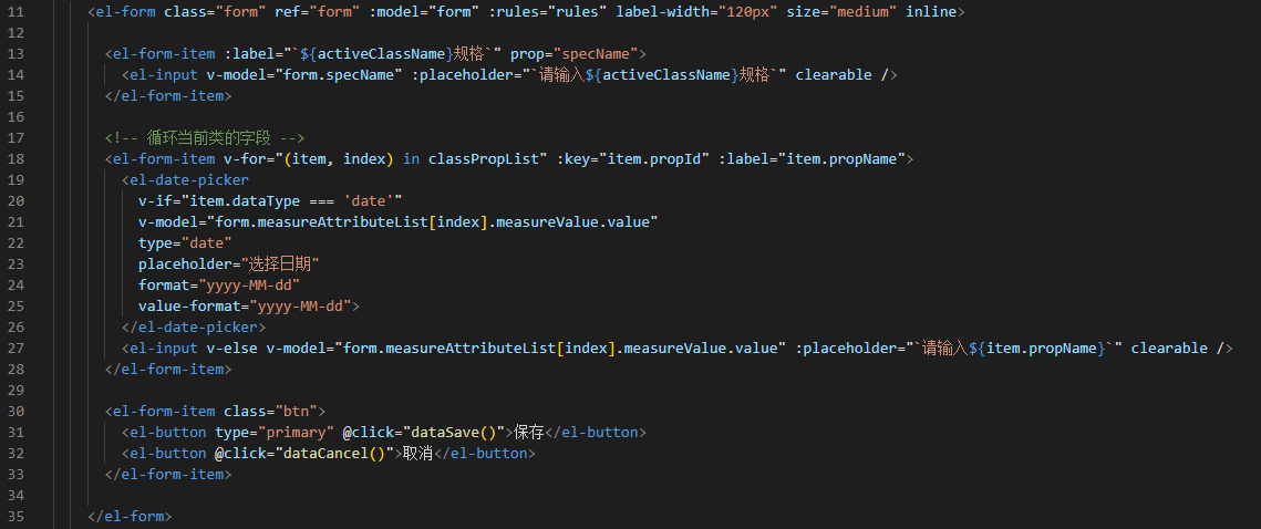
实现效果 实现代码 html div class=peeek-loading ul li/li li/li li/li li/li li/li li/li li/li li/li li/li li/li /ul/div css3 .peeek-loading { background-color: #38d368; overflow: hidden; position: absolute; top: 0; bottom: 0; left: 0; right:

实现效果


实现代码

html

<div class='peeek-loading'>
  <ul>
    <li></li>
    <li></li>
    <li></li>
    <li></li>
    <li></li>
    <li></li>
    <li></li>
    <li></li>
    <li></li>
    <li></li>
  </ul>
</div>
 

css3

.peeek-loading {
  background-color: #38d368;
  overflow: hidden;
  position: absolute;
  top: 0;
  bottom: 0;
  left: 0;
  right: 0;
  height: 100%;
  width: 100%;
}

.peeek-loading ul {
  position: absolute;
  left: calc(50% - 0.7em);
  top: calc(50% - 4.2em);
  display: inline-block;
  text-indent: 2.8em;
}

.peeek-loading ul li:after,
.peeek-loading ul:after {
  width: 1.4em;
  height: 1.4em;
  background-color: #fff;
  border-radius: 100%;
}

.peeek-loading ul li:after,
.peeek-loading ul:after {
  content: "";
  display: block;
}

.peeek-loading ul:after {
  position: absolute;
  top: 2.8em;
}

.peeek-loading li {
  position: absolute;
  padding-bottom: 5.6em;
  top: 0;
  left: 0;
}

.peeek-loading li:nth-child(1) {
  transform: rotate(0deg);
  animation-delay: 0.125s;
}

.peeek-loading li:nth-child(1):after {
  animation-delay: 0.125s;
}

.peeek-loading li:nth-child(2) {
  transform: rotate(36deg);
  animation-delay: 0.25s;
}

.peeek-loading li:nth-child(2):after {
  animation-delay: 0.25s;
}

.peeek-loading li:nth-child(3) {
  transform: rotate(72deg);
  animation-delay: 0.375s;
}

.peeek-loading li:nth-child(3):after {
  animation-delay: 0.375s;
}

.peeek-loading li:nth-child(4) {
  transform: rotate(108deg);
  animation-delay: 0.5s;
}

.peeek-loading li:nth-child(4):after {
  animation-delay: 0.5s;
}

.peeek-loading li:nth-child(5) {
  transform: rotate(144deg);
  animation-delay: 0.625s;
}

.peeek-loading li:nth-child(5):after {
  animation-delay: 0.625s;
}

.peeek-loading li:nth-child(6) {
  transform: rotate(180deg);
  animation-delay: 0.75s;
}

.peeek-loading li:nth-child(6):after {
  animation-delay: 0.75s;
}

.peeek-loading li:nth-child(7) {
  transform: rotate(216deg);
  animation-delay: 0.875s;
}

.peeek-loading li:nth-child(7):after {
  animation-delay: 0.875s;
}

.peeek-loading li:nth-child(8) {
  transform: rotate(252deg);
  animation-delay: 1s;
}

.peeek-loading li:nth-child(8):after {
  animation-delay: 1s;
}

.peeek-loading li:nth-child(9) {
  transform: rotate(288deg);
  animation-delay: 1.125s;
}

.peeek-loading li:nth-child(9):after {
  animation-delay: 1.125s;
}

.peeek-loading li:nth-child(10) {
  transform: rotate(324deg);
  animation-delay: 1.25s;
}

.peeek-loading li:nth-child(10):after {
  animation-delay: 1.25s;
}

.peeek-loading li {
  animation: dotAnimation 2.5s infinite;
}

@keyframes dotAnimation {
  0%, 55%, 100% {
    padding: 0 0 5.6em 0;
  }
  5%, 50% {
    padding: 2.8em 0;
  }
}
.peeek-loading li:after {
  animation: dotAnimationTwo 2.5s infinite;
}

@-webkit-keyframes dotAnimationTwo {
  0%, 55%, 100% {
    opacity: 1;
    transform: scale(1);
  }
  5%, 50% {
    opacity: 0.5;
    transform: scale(0.5);
  }
}


版权声明 : 本文内容来源于互联网或用户自行发布贡献,该文观点仅代表原作者本人。本站仅提供信息存储空间服务和不拥有所有权,不承担相关法律责任。如发现本站有涉嫌抄袭侵权, 违法违规的内容, 请发送邮件至2530232025#qq.cn(#换@)举报,一经查实,本站将立刻删除。
原文链接 : https://www.jb51.net/css/770427.html
相关文章
  • 本站所有内容来源于互联网或用户自行发布,本站仅提供信息存储空间服务,不拥有版权,不承担法律责任。如有侵犯您的权益,请您联系站长处理!
  • Copyright © 2017-2022 F11.CN All Rights Reserved. F11站长开发者网 版权所有 | 苏ICP备2022031554号-1 | 51LA统计