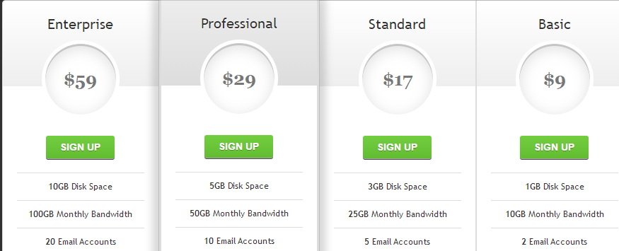
body{
  background: #303030;
}

#pricing-table {
	margin: 100px auto;
	text-align: center;
	width: 892px; /* total computed width = 222 x 3 + 226 */
}

#pricing-table .plan {
	font: 12px 'Lucida Sans', 'trebuchet MS', Arial, Helvetica;
	text-shadow: 0 1px rgba(255,255,255,.8);
	background: #fff;
	border: 1px solid #ddd;
	color: #333;
	padding: 20px;
	width: 180px; /* plan width = 180 + 20 + 20 + 1 + 1 = 222px */
	float: left;
	position: relative;
}

#pricing-table #most-popular {
	z-index: 2;
	top: -13px;
	border-width: 3px;
	padding: 30px 20px;
	-moz-border-radius: 5px;
	-webkit-border-radius: 5px;
	border-radius: 5px;
	-moz-box-shadow: 20px 0 10px -10px rgba(0, 0, 0, .15), -20px 0 10px -10px rgba(0, 0, 0, .15);
	-webkit-box-shadow: 20px 0 10px -10px rgba(0, 0, 0, .15), -20px 0 10px -10px rgba(0, 0, 0, .15);
	box-shadow: 20px 0 10px -10px rgba(0, 0, 0, .15), -20px 0 10px -10px rgba(0, 0, 0, .15);
}

#pricing-table .plan:nth-child(1) {
	-moz-border-radius: 5px 0 0 5px;
	-webkit-border-radius: 5px 0 0 5px;
	border-radius: 5px 0 0 5px;
}

#pricing-table .plan:nth-child(4) {
	-moz-border-radius: 0 5px 5px 0;
	-webkit-border-radius: 0 5px 5px 0;
	border-radius: 0 5px 5px 0;
}

/* --------------- */

#pricing-table h3 {
	font-size: 20px;
	font-weight: normal;
	padding: 20px;
	margin: -20px -20px 50px -20px;
	background-color: #eee;
	background-image: -moz-linear-gradient(#fff,#eee);
	background-image: -webkit-gradient(linear, left top, left bottom, from(#fff), to(#eee));
	background-image: -webkit-linear-gradient(#fff, #eee);
	background-image: -o-linear-gradient(#fff, #eee);
	background-image: -ms-linear-gradient(#fff, #eee);
	background-image: linear-gradient(#fff, #eee);
}

#pricing-table #most-popular h3 {
	background-color: #ddd;
	background-image: -moz-linear-gradient(#eee,#ddd);
	background-image: -webkit-gradient(linear, left top, left bottom, from(#eee), to(#ddd));
	background-image: -webkit-linear-gradient(#eee, #ddd);
	background-image: -o-linear-gradient(#eee, #ddd);
	background-image: -ms-linear-gradient(#eee, #ddd);
	background-image: linear-gradient(#eee, #ddd);
	margin-top: -30px;
	padding-top: 30px;
	-moz-border-radius: 5px 5px 0 0;
	-webkit-border-radius: 5px 5px 0 0;
	border-radius: 5px 5px 0 0;
}

#pricing-table .plan:nth-child(1) h3 {
	-moz-border-radius: 5px 0 0 0;
	-webkit-border-radius: 5px 0 0 0;
	border-radius: 5px 0 0 0;
}

#pricing-table .plan:nth-child(4) h3 {
	-moz-border-radius: 0 5px 0 0;
	-webkit-border-radius: 0 5px 0 0;
	border-radius: 0 5px 0 0;
}

#pricing-table h3 span {
	display: block;
	font: bold 25px/100px Georgia, Serif;
	color: #777;
	background: #fff;
	border: 5px solid #fff;
	height: 100px;
	width: 100px;
	margin: 10px auto -65px;
	-moz-border-radius: 100px;
	-webkit-border-radius: 100px;
	border-radius: 100px;
	-moz-box-shadow: 0 5px 20px #ddd inset, 0 3px 0 #999 inset;
	-webkit-box-shadow: 0 5px 20px #ddd inset, 0 3px 0 #999 inset;
	box-shadow: 0 5px 20px #ddd inset, 0 3px 0 #999 inset;
}

/* --------------- */

#pricing-table ul {
	margin: 20px 0 0 0;
	padding: 0;
	list-style: none;
}

#pricing-table li {
	border-top: 1px solid #ddd;
	padding: 10px 0;
}

/* --------------- */

#pricing-table .signup {
	position: relative;
	padding: 8px 20px;
	margin: 20px 0 0 0;
	color: #fff;
	font: bold 14px Arial, Helvetica;
	text-transform: uppercase;
	text-decoration: none;
	display: inline-block;
	background-color: #72ce3f;
	background-image: -moz-linear-gradient(#72ce3f, #62bc30);
	background-image: -webkit-gradient(linear, left top, left bottom, from(#72ce3f), to(#62bc30));
	background-image: -webkit-linear-gradient(#72ce3f, #62bc30);
	background-image: -o-linear-gradient(#72ce3f, #62bc30);
	background-image: -ms-linear-gradient(#72ce3f, #62bc30);
	background-image: linear-gradient(#72ce3f, #62bc30);
	-moz-border-radius: 3px;
	-webkit-border-radius: 3px;
	border-radius: 3px;
	text-shadow: 0 1px 0 rgba(0,0,0,.3);
	-moz-box-shadow: 0 1px 0 rgba(255, 255, 255, .5), 0 2px 0 rgba(0, 0, 0, .7);
	-webkit-box-shadow: 0 1px 0 rgba(255, 255, 255, .5), 0 2px 0 rgba(0, 0, 0, .7);
	box-shadow: 0 1px 0 rgba(255, 255, 255, .5), 0 2px 0 rgba(0, 0, 0, .7);
}

#pricing-table .signup:hover {
	background-color: #62bc30;
	background-image: -moz-linear-gradient(#62bc30, #72ce3f);
	background-image: -webkit-gradient(linear, left top, left bottom, from(#62bc30), to(#72ce3f));
	background-image: -webkit-linear-gradient(#62bc30, #72ce3f);
	background-image: -o-linear-gradient(#62bc30, #72ce3f);
	background-image: -ms-linear-gradient(#62bc30, #72ce3f);
	background-image: linear-gradient(#62bc30, #72ce3f);
}

#pricing-table .signup:active, #pricing-table .signup:focus {
	background: #62bc30;
	top: 2px;
	-moz-box-shadow: 0 0 3px rgba(0, 0, 0, .7) inset;
	-webkit-box-shadow: 0 0 3px rgba(0, 0, 0, .7) inset;
	box-shadow: 0 0 3px rgba(0, 0, 0, .7) inset;
}

/* --------------- */

.clear:before, .clear:after {
  content:"";
  display:table
}

.clear:after {
  clear:both
}

.clear {
  zoom:1
}
|


