<template>
<div class="polar">
<div class="polar-main">
<div class="polar-1">
<div class="polar-2">
<div class="polar-3">
<p
v-for="item in latitudes"
:key="item.id"
class="latitude"
:style="{
top: item.location.top,
transform: item.location.transform,
}"
>
{{ item.value }}
</p>
<div class="polar-center">
<div class="satellites">
<div v-for="item in satellites" :key="item.name">
<p
v-for="ele in item.distribution"
:key="ele.id"
class="satellite-box"
:style="{
transform: rotate(ele.long),
}"
>
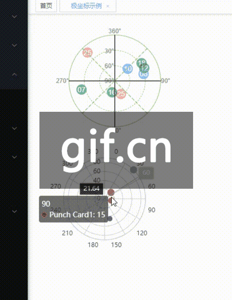
<el-tooltip
class="item"
effect="dark"
:content="`经度:${ele.long} 纬度:${ele.lati}`"
placement="top-start"
>
<span
class="satellite"
:style="{
backgroundColor: ele.color,
top: top(ele.lati),
transform: rotate(-1 * ele.long),
}"
>{{ ele.id }}</span
>
</el-tooltip>
</p>
</div>
</div>
</div>
</div>
</div>
</div>
<p
v-for="item in lines"
:key="item.id"
class="line"
:style="{
transform: item.transform,
borderStyle: item.borderStyle,
borderColor: item.borderColor,
}"
></p>
<p
v-for="item in longitudes"
:key="item.id"
class="longitude"
:style="{
top: item.location.top,
left: item.location.left,
transform: item.location.transform,
}"
>
{{ item.value }}
</p>
</div>
<div class="satellite-name"></div>
</div>
</template>
<script>
export default {
data() {
return {
lines: [
        {
          id: 1,
          transform: "translateX(-50%) rotateZ(0deg) scaleX(0.4)",
          borderStyle: "solid",
          borderColor: "#333",
        },
        {
          id: 2,
          transform: "translateX(-50%) rotateZ(45deg) scaleX(0.4)",
          borderStyle: "dashed",
          borderColor: "#91cc75",
        },
        {
          id: 3,
          transform: "translateX(-50%) rotateZ(90deg) scaleX(0.4)",
          borderStyle: "solid",
          borderColor: "#333",
        },
        {
          id: 4,
          transform: "translateX(-50%) rotateZ(135deg) scaleX(0.4)",
          borderStyle: "dashed",
          borderColor: "#91cc75",
        },
      ],
longitudes: [
{
id: 5,
value: "90°",
location: {
top: "50%",
left: "100%",
transform: "translateY(-50%)",
},
},
{
id: 6,
value: "180°",
location: {
top: "100%",
left: "50%",
transform: "translateX(-50%)",
},
},
{
id: 7,
value: "270°",
location: {
top: "50%",
left: "0",
transform: "translateX(-100%) translateY(-50%)",
},
},
{
id: 8,
value: "360°",
location: {
top: "0",
left: "50%",
transform: "translateX(-50%) translateY(-100%)",
},
},
],
latitudes: [
{
id: 1,
value: "90°",
location: {
top: "50%",
left: "0",
transform: "translateY(-50%) translateX(50%)",
},
},
{
id: 2,
value: "60°",
location: {
top: "0",
left: "0",
transform: "translateY(-50%) translateX(50%)",
},
},
{
id: 3,
value: "30°",
location: {
top: "-50%",
left: "0",
transform: "translateY(-50%) translateX(50%)",
},
},
],
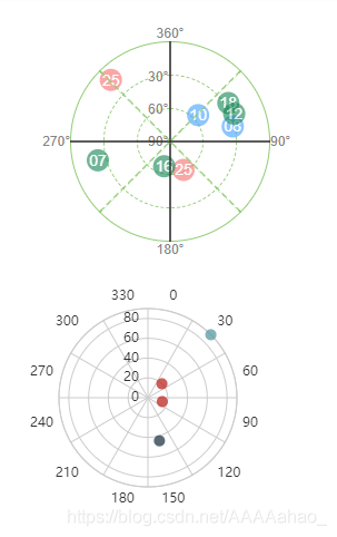
satellites: [
{
name: "Below Mask",
distribution: [
{
id: "10",
long: 46.397128,
lati: 56.397128,
color: "#409eff",
},
{
id: "08",
long: 76.397128,
lati: 32.916527,
color: "#409eff",
},
],
},
{
name: "Unhealthy",
distribution: [
{
id: "25",
long: 156.397128,
lati: 62.916527,
color: "#f56c6c",
},
{
id: "25",
long: 316.397128,
lati: 12.916527,
color: "#f56c6c",
},
],
},
{
name: "Missing",
distribution: [
{
id: "07",
long: 256.397128,
lati: 22.916527,
color: "#118452",
},
{
id: "18",
long: 56.397128,
lati: 27.916527,
color: "#118452",
},
{
id: "12",
long: 66.397128,
lati: 27.916527,
color: "#118452",
},
{
id: "16",
long: 196.397128,
lati: 67.916527,
color: "#118452",
},
],
},
],
};
},
methods: {
top(lati) {
return ((90 - lati) / 90) * -90 - 10 + "px";
},
rotate(long) {
let z = (long / 360) * 360;
return `rotateZ(${z}deg)`;
},
},
// filters: {},
};
</script>
<style scoped lang='scss'>
$polarPiameter: 180px;
.polar-main {
width: $polarPiameter;
height: $polarPiameter;
position: relative;
p {
margin: 0;
}
.polar-1 {
width: $polarPiameter;
height: $polarPiameter;
border-style: solid;
.polar-2 {
width: $polarPiameter * 2/3;
height: $polarPiameter * 2/3;
border-style: dashed;
.polar-3 {
width: $polarPiameter/3;
height: $polarPiameter/3;
border-style: dashed;
.polar-center {
width: 1px;
height: 1px;
background-color: #333;
}
}
}
}
.line {
height: $polarPiameter;
border-right-color: #333;
border-right-width: 1px;
border-right-style: solid;
position: absolute;
left: 50%;
cursor: pointer;
}
.longitude,
.latitude {
height: 14px;
line-height: 14px;
font-size: 12px;
color: #868585;
position: absolute;
cursor: pointer;
}
}
.polar-1,
.polar-2,
.polar-3,
.polar-center {
border-radius: 50%;
position: absolute;
top: 0;
left: 0;
right: 0;
bottom: 0;
margin: auto;
border-color: #91cc75;
border-width: 1px;
box-sizing: border-box;
cursor: pointer;
}
.polar-1:hover {
border-width: 2px;
}
.polar-2:hover{
border-width: 2px;
}
.satellite-box {
position: absolute;
width: 1px;
height: 1px;
border-radius: 50%;
background-color: transparent;
.satellite {
position: absolute;
left: -10px;
width: 20px;
height: 20px;
line-height: 20px;
text-align: center;
border-radius: 50%;
font-size: 14px;
color: #fff;
cursor: pointer;
z-index: 999;
opacity: 0.6;
transition: 0.6s;
}
.satellite:hover {
background-color: #333 !important;
}
}
</style>
|


