
使用CSS3进行样式效果增强

使用CSS3进行增强 滑过文字渐变 1 2 3 4 5 6 /* 这段代码实现了当鼠标滑过链接时的渐变效果 */ a { color: #007c21; transition: color .4s ease; } a:hover { color: #00bf32; } 为元素创建圆角 使用CSS3可以在不引入额
使用CSS3进行增强滑过文字渐变
为元素创建圆角使用CSS3可以在不引入额外的标记或图像的情况下,为大多数元素(包括表单元素、图像,甚至段落文本)创建圆角。
使用CSS圆角的四个例子,包含了必要的厂商前缀以支持旧版的Android、Mobile Safari和Safari浏览器。对于.circle,使用75px与50%的效果是一样的,因为该元素的大小为150像素*150像素。
为元素创建四个相同的圆角
为元素创建一个圆角
创建椭圆形圆角
使用border-radius(属性不是继承的)创建图形
注:不支持border-radius的旧的浏览器仅会以方角呈现元素。border-radius仅影响施加该样式的元素的角,不会影响其子元素的角。因此如果一个子元素有背景,该背景就有可能显示在一个或多个父元素的角的位置,从而影响圆角样式。有时元素的背景(这里讲的不是子元素的背景)会透过其圆角。为了避免这种情况,可以在元素的border-radius声明后面增加一条样式规则:background-clip: padding-box;。 为文本添加阴影使用text-shadow可以在不使用图像表示文本的情况下,为段落、标题等元素中的文本添加动态的阴影效果。 为元素的文本添加阴影
为元素的文本添加多重阴影
这些类演示了几种text-shadow的效果。第一个、第二个和第五个都省略了模糊半径的值。.multiple类告诉我们,可以为单个元素添加多个阴影样式,每组属性之间用逗号分隔。这样,通过结合使用多个阴影样式,可以创建出特殊而有趣的效果。 将text-shadow(属性是继承的)改回默认值即输入text-shadow: none;,这个属性不需要输入使用厂商前缀。 text-shadow属性接受四个值:带长度单位的x-offset、带长度单位的y-offset、可选的带长度单位的blur-radius以及color值。如不指定blur-radius,将假定其值为0。x-offset和y-offset值可以是正整数也可以是负整数,也就是说1px和-1px都是有效的。blur-radius值必须是正整数。这三个值都可以为0。尽管text-shadow的语法与边框和背景属性的语法是类似的,但它不能像边框和背景那样单独的指定四个属性值。如果不指定text-shadow,它就会使用初始值none。 为其他元素添加阴影使用text-shadow属性可以为元素的文本添加阴影,使用box-shadow属性则可以为元素本身添加阴影。他们的基础属性集是相同的,不过box-shadow还允许使用使用两个可选的属性:inset关键字属性和spread属性(用于扩张或收缩阴影)。 box-shadow属性接受六个值:带长度单位的x-offset和y-offset、可选的带长度单位的blur-radius、可选的inset关键字、可选的带长度单位的spread值及color值。如果不指定blur-radius和spread的值,则设为0。
上面程序用于演示使用box-shadow添加一个或多个阴影的效果。前五个类各自应用了一个彼此不同的阴影样式。最后一个类应用了两个阴影(还可以应用更多个阴影)。不理解box-shadow的浏览器会直接忽略这些CSS样式规则,呈现没有阴影的页面。 为元素添加阴影
创建内阴影
为元素应用多重阴影
将box-shadow(属性是不继承的)改回默认值
注:x-offset、y-offset和spread值可以是正整数,也可以是负整数。blur-radius值必须是正整数。这三个值都可以为零。inset关键字可以让阴影位于元素内部。 应用多重背景多重背景几乎可以应用于任何元素。
为单个元素应用多重背景图像(不需要使用厂商前缀)
对于多重背景图像,可以使用标准的短形式语法,即使用逗号分隔每组背景参数。这种表示方法的好处是开发者既可以指定备用背景颜色,也可以为旧的浏览器指定图像。
使用渐变背景
创建备用背景颜色输入background: color或者background-color: color,这里的color可以是十六进制数、RGB值以及其他任何支持的颜色名称,另外也可以使用图像。最好不要将RGBA、HSL或HSLA值作为备用背景颜色(如果你不打算支持IE则不必在意),因为IE8及以前的版本不支持。 定义线性渐变
定义径向渐变
指定颜色
为元素设置不透明度(opacity属性不继承)使用opacity属性可以修改元素的透明度。方法是输入opacity: x,这里的x表示元素元素的不透明程度(两位小数,不带单位)。 opacity的默认值为1(完全不透明),范围为0~1。 通过使用opacity属性和:hover伪属性,可以产生一些有趣且实用的效果。例如img { opacity: .75; }默认情况下可以将图片设置为75%的不透明度,img:hover { opacity: 1; }可导致用户鼠标停留在元素上时元素变为不透明。在将缩略图链接到全尺寸版本时经常看到这种效果。对于访问者来说,悬浮可增强图像的动感。 opacity属性与使用RGBA或HSLA设置的透明背景色是两个容易混淆的概念。opacity影响的是整个元素(包括其内容),而background-color: rgba(128,0,64,.6);这样的设置仅影响背景的透明度。 生成内容的效果使用:before和:after伪元素可以很方便地为页面添加一些令人难以置信的设计效果。它们可以与content属性结合使用,从而创建所谓的生成内容。生成内容指的是通过CSS创建的内容而不是HTML生成的。
通过上面代码,可以使带有class="more"的元素会在其后显示一个双箭头,以后如需变动,修改也只需要修改.more类即可,而不需要改动大量的HTML页面。 使用sprite拼合图像浏览器中文本显示速度很快,但是图像往往会减慢页面的加载速度。为解决这一问题,可以将多个图像拼合成单个背景图像(sprite),再通过CSS控制具体显示图像的哪一部分,使用的就是background-position属性。
可以将sprite应用于任意数量的元素。在上面这个例子中,使用.icon:before来实现所需的效果。这样sprite就是通过content: " ";生成的空格的背景图像。将其设置为display: block;,从而就可以设置与图标大小匹配的高度和宽度。没有这三个属性,图像将不会显示。通过使用background-position,可以将正确的图标放入该位置。 |
您可能感兴趣的文章 :

-
CSS中:required和:optional伪类:增强表单字段的视觉
在网页设计中,表单是用户与网站交互的重要元素之一。为了提升用户体验并引导用户正确填写表单,开发者需要清晰地标识出哪些字段是 -
使用CSS3进行样式效果增强
使用CSS3进行增强 滑过文字渐变 1 2 3 4 5 6 /* 这段代码实现了当鼠标滑过链接时的渐变效果 */ a { color: #007c21; transition: color .4s ease; } a:hover { -
CSS文本超出后隐藏并显示省略号及其他浏览器兼
1、只显示一行文字后隐藏并省略 1 2 3 4 5 6 7 // 只显示一行文字后省略 .element { width: 300px; /* 需要设置一个固定宽度 */ white-space: nowrap; /* 强制 -
css3实现动态滚动播放列表功能
需要自动滚动循环播放的列表,使用纯CSS实现基础循环功能 1 2 3 4 5 6 7 8 9 10 11 12 13 14 15 16 17 18 19 20 .messages animation-name carousel animation-timing- -

CSS3边框样式(包含border-radius、border-image与box-sha
CSS3 边框样式 border-radius 作用:设置圆角 值的个数及其效果 简记:左上开始顺时针,值不够的对角来凑。 值的个数 效果 1 四个角一致 2 左 -
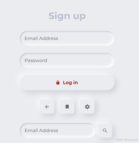
css3使用box-shadow实现浮雕风格按钮效果
利用 box-shadow 实现浮雕风格的按钮。 HTML: 1 2 3 4 5 6 7 8 9 10 11 12 13 14 15 16 17 18 19 20 21 22 23 form div class=segment h1Sign up/h1 /div label input type=text p -
CSS的font-stretch属性与字符胖瘦控制(使用示例)
font-stretchCSS 属性用于选择字体的一个更宽(expanded)或更窄(condensed)的版本,以控制字符的胖瘦。然而,需要注意的是,并非所有的字体 -
CSS属性fit-content示例介绍
CSS属性:fit-content 1 2 3 4 5 6 div class=content img src=src\assets\404_images\xxmLogo.png alt= div class=frosted-glass pThis is a frosted glass effect./p /div /div 1 2 3 4 5 6


-
CSS3制作的图片滚动效果
2021-04-14
-
CSS实现音频播放时柱状波动效果
2023-10-11
-
CSS3实现的侧滑菜单的教程
2021-04-29
-
使用CSS实现带追踪特效的渐变按钮
2023-11-01
-
英伟达:听说你想搞科研,钱交够了
2018-01-07

