本篇文章给大家介绍CSS实现镂空效果的代码方法。
效果原理
主要利用css渐变实现一些不需要切图的背景镂空
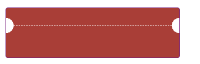
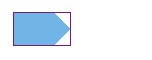
优惠券样式
.mixinsTicket(@width, @height, @r, @left, @lcolor, @rcolor) {
    width: @width;
    height: @height;
    background:
              radial-gradient(circle at top right, transparent @r, @lcolor 0) -(@width - @left) top ~'/' 100% 51% no-repeat,
              radial-gradient(circle at bottom right, transparent @r, @lcolor 0) -(@width - @left) bottom ~'/' 100% 51% no-repeat,
              radial-gradient(circle at top left, transparent @r, @rcolor 0) @left 0 ~'/' 100% 51% no-repeat,
              radial-gradient(circle at bottom left, transparent @r, @rcolor 0) @left bottom ~'/' 100% 51%  no-repeat;
|
.mixinsTicket1(@width, @height, @r, @top, @color) {
   width: @width;
   height: @height;
   background:
               radial-gradient(circle at bottom left, transparent @r, @color 0) left (@top - @height) ~'/' 51% 100% no-repeat,
               radial-gradient(circle at top left, transparent @r, @color 0) left @top ~'/' 51% 100% no-repeat,
               radial-gradient(circle at bottom right, transparent @r, @color 0) right (@top - @height) ~'/' 51% 100% no-repeat,
               radial-gradient(circle at top right, transparent @r, @color 0) right @top ~'/' 51% 100%  no-repeat;
   &::after{
     content: '';
     display: block;
     position: absolute;
     width: calc(100% - 2 * @r);
     left: @r;
     top: @top;
     border-top: 1px dashed #fff;
     transform: translateY(.5);
   }
}
|
切角效果
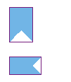
ps: 锯齿跟设备的显示有关系
.mixinFlag(@width, @height, @bg) when(default()) {
    width: @width;
    height: @height;
    background:
              linear-gradient(45deg, transparent sqrt(pow(@width/2, 2)/2), @bg 0) right,
              linear-gradient(-45deg, transparent sqrt(pow(@width/2, 2)/2),  @bg 0) left;
    background-size: 50% 100%;
    background-repeat: no-repeat;
 }
 .mixinFlag(@width, @height, @bg) when(@width > @height) {
    width: @width;
    height: @height;
    background:
              linear-gradient(-45deg, transparent sqrt(pow(@height/2, 2)/2), @bg 0) top left,
              linear-gradient(-135deg, transparent sqrt(pow(@height/2, 2)/2), @bg 0) bottom left;
    background-size: 100% 50%;
    background-repeat: no-repeat;
|
.mixinsMark(@width, @height, @bg) {
    width: @width;
    height: @height;
    background:
              linear-gradient(-45deg, transparent sqrt(pow(@height/2, 2)/2), @bg 0) bottom left,
              linear-gradient(-135deg, transparent sqrt(pow(@height/2, 2)/2), @bg 0) top left;
    background-size: 100% 50%;
    background-repeat: no-repeat;
}
|
ps:以上效果四个方向都可以实现,其他方向代码没有贴出,原理相同
格子布
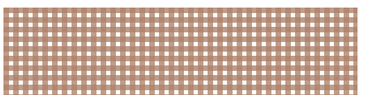
css {
    width: 510px;
    height: 128px;
    background: #FFF;
    background-image: linear-gradient(rgba(182, 128, 102, .8) 8px, transparent 0),
                      linear-gradient(90deg, rgba(182, 128, 102, .8) 8px, transparent 0);
    background-size: 8px 14px, 14px 8px;
}
|
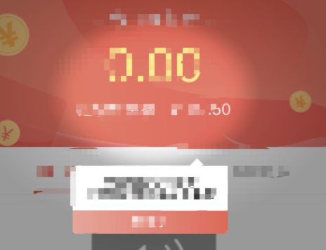
焦点
.mask {
  position: fixed;
  top: 0;
  left: 0;
  z-index: 100;
  width: 100vw;
  height: 100vh;
  background:
  radial-gradient(closest-side at 50% 278rpx, transparent 140rpx, rgba(0, 0, 0, .12) 180rpx, rgba(0, 0, 0, .22) 200rpx, rgba(0,0,0,.3) 220rpx, rgba(0,0,0, .4)) no-repeat;
}
|
每一层渐变都可被当做一张背景图,也就是说每一层渐变都可以指定其position、size、repeat。
玩过PS的的同学应该知道图层的概念,咱们的背景图层叠原理也类似(当然,渐变也可以当背景图),控制渐变的大小,哪里需要镂空,以及需要显示的位置、是否平铺,就可以实现大多数场景下的基本效果,当然,一张切图来的更快,但是有时候切图并不能适应所有的场景。
掌握background的书写顺序可以帮助在脑海中构思自己想要的效果:
background: bg-color || bg-image || bg-position [ / bg-size]? || bg-repeat || bg-attachment || bg-origin || bg-clip
|


